People Analytics for HR: A Beginner's Guide to Data-Driven Decisions

TL;DR
- People analytics is the practice of using employee data to make better, faster HR decisions. Think of it as a discipline you build, not a piece of software you install.
- You do not need a data scientist to start. You need 4 to 6 clear HR metrics, a regular review rhythm, and a willingness to act on what the data shows.
- The four maturity stages of people analytics are descriptive (what happened), diagnostic (why it happened), predictive (what will happen), and prescriptive (what to do next). Most HR teams stop at stage one.
- Start this week: pick one business question, find the two metrics that answer it, and review them with one decision-maker every Friday.
Most HR teams have more data than they have ever had, and somehow less clarity than ever. There is a dashboard for engagement, another for attrition, a slide deck from the last survey, and a folder of exit interview notes that nobody has read in months. People analytics is supposed to fix this. But for most HR leaders, the gap between “we have data” and “we make better decisions” is enormous.
This guide is for HR leaders who want to close that gap without hiring a data team, buying another platform, or learning Python. I will walk through what people analytics actually is, why data-driven HR has become non-negotiable, the four stages of maturity to aim for, the workforce analytics metrics that genuinely move the needle, and how to start in the next 14 days. The goal is not to make you a data scientist. It is to make you the kind of HR leader executives bring into strategy conversations, not just compliance ones.
What is people analytics?
People analytics is the practice of collecting, analyzing, and acting on workforce data to make better people decisions. It covers everything from hiring and onboarding to engagement, performance, compensation, and attrition. Sometimes it is called HR analytics, talent analytics, or workforce analytics. The labels differ slightly but the intent is the same: use evidence instead of instinct to guide how you build and support your workforce.
The shift matters because HR has historically run on opinion, anecdote, and tradition. “We always do reviews in Q4.” “Engagement is fine, my manager hasn’t heard complaints.” “We lost three good people, but I think it was just bad timing.” People analytics replaces those guesses with patterns. It tells you whether the three departures were random or part of a wider signal you missed.
A common misconception is that people analytics requires advanced statistics. It does not. The most useful work in this space is often a simple comparison: are we losing more women than men in the first 90 days? Are managers with above-average engagement scores also driving above-average performance? Those questions can be answered with a spreadsheet and an honest read.
Why does people analytics matter for HR right now?
A few things have changed in the last 24 months that make this shift unavoidable for HR leaders.
Executives have gotten more sophisticated. CFOs and CEOs are no longer satisfied with HR updates that say “engagement is trending up.” They want to know which teams, why, and what it means for retention costs. If you walk into a leadership meeting without segmented HR metrics, you increasingly walk out without budget.
The cost of bad people decisions has also climbed. Replacement costs for a mid-level employee can run 50 to 200 percent of annual salary once you factor in productivity loss, recruiting, and ramp time, according to research summarized by SHRM. When the wrong manager gets promoted, the downstream cost in team attrition is rarely measured but always paid.
And AI has reset the economics. Tasks that used to require a dedicated analyst, like classifying open-ended feedback or summarizing a year’s worth of 1:1 notes, can now be done in seconds. According to Deloitte’s 2025 Global Human Capital Trends report, organizations that connect their human and business data are significantly more likely to achieve strong financial outcomes. The barrier is no longer technology. It is willingness to look honestly at what the data shows.
This is the gap Pulsewise was built to close. The core belief behind the platform is simple: people don’t experience work annually, they experience it daily. So measurement and support need to match that rhythm, not lag behind it by six months. A once-a-year survey cannot guide weekly decisions. Continuous signals can.
What are the four stages of people analytics maturity?
Most HR teams operate at stage one and assume that is what people analytics means. Knowing where you actually sit on the maturity curve helps you set realistic goals.
| Stage | Question it answers | Example signal | What you need |
|---|---|---|---|
| 1. Descriptive | What happened? | Turnover was 14% last quarter. Engagement score is 72. | A spreadsheet and a basic dashboard. |
| 2. Diagnostic | Why did it happen? | Engineering attrition is 2x the company average. 70% of leavers had a recent manager change. | Segmented data and a clear hypothesis. |
| 3. Predictive | What is likely to happen next? | These 12 employees show patterns associated with flight risk. | Historical data and an AI-assisted tool. |
| 4. Prescriptive | What should we do about it? | Schedule a wellbeing check-in with this employee this week. | Action signals and recommendation logic. |
The honest reality is that most companies say they are at stage three but operate at stage one. There is no shame in that. The trick is not to skip stages, it is to move through them deliberately.
Which people analytics metrics should HR teams start with?
Forget the 47-metric dashboard. If you are starting from scratch on talent analytics, pick from this short list. Each one answers a real business question.
- Voluntary turnover rate (by segment). Not just the company average. Break it out by department, manager, tenure band, and demographic. The story is always in the slices.
- First-year attrition. People who leave within their first 12 months tell you something about hiring quality, onboarding, or manager fit. This is often the cheapest fix with the biggest payoff.
- Engagement or DailyMood trend. A point-in-time engagement score is almost useless. A trend over weeks tells you whether something is shifting before it shows up in resignations. This is where short, frequent pulse surveys earn their keep, because the signal you need lives between annual cycles.
- Internal mobility rate. The percentage of open roles filled internally. Low internal mobility is a quiet driver of attrition for your top performers.
- Manager effectiveness signal. This is a composite, not one number. Combine team engagement, 1:1 cadence, and direct report retention. The pattern reveals which managers are quietly carrying the org and which are quietly losing it.
Here is what “break it out by segment” actually looks like in practice. The US national quits rate sits at a tidy 2.4% per month, but the moment you slice it by industry, the signal jumps out.
Annual average quits rate by industry, US (2023)
A 2.4% national average hides a 5.5x spread between industries. The same kind of gap shows up between teams inside one company once you start looking.
You do not need all five on day one. Pick two that tie to the business problem your CEO talks about most, and start there.
How do I start people analytics in 30 days?
The biggest blocker to data-driven HR is not data or tools. It is the absence of a regular rhythm. Here is a practical 30-day path.
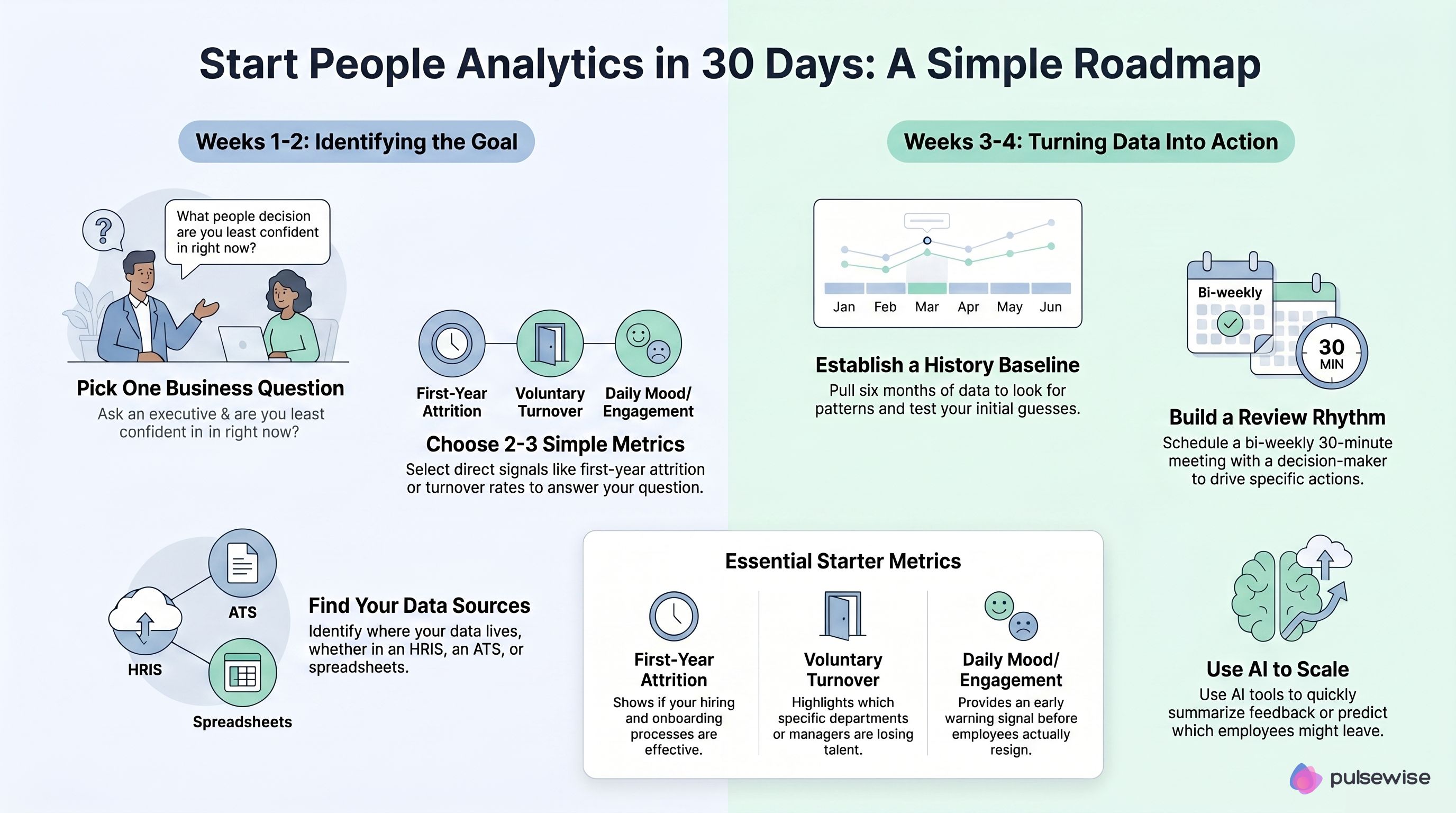
Week 1 - Pick the question, not the metric. Sit down with one executive. Ask: “What is the people decision you are least confident in right now?” Maybe it is whether to invest in a leadership development program. Maybe it is why a specific team keeps losing senior people. That question becomes your anchor.
Week 2 - Find the two metrics that answer it. Resist the urge to build a 12-tab dashboard. Identify the two most direct signals. If the question is “are we losing good engineers?”, the two metrics might be regretted attrition rate in Engineering and average tenure at exit.
Week 3 - Establish a baseline. Pull six months of history. Look at the pattern. Compare to other teams. Note your hypothesis in plain writing: “I think attrition in Engineering is being driven by lack of internal mobility, not pay.” A documented hypothesis you can be wrong about is more valuable than ten dashboards you cannot interpret.
Week 4 - Build the rhythm. Schedule a 30-minute review every two weeks with the same decision-maker. These meetings exist to drive decisions, not to deliver updates. Each review should end with one action item and one person responsible.
This is also where AI starts to pay for itself. A manager preparing for a quarterly review used to need an hour to scan notes, surveys, goals, and 1:1 history. Tools like Pulsewise’s AI Employee Summary compress that into a few seconds. It pulls together recent wins, momentum signals, risk indicators, and suggested next actions for each employee. Instead of going into a review with a blank page, the manager arrives with a structured starting point. That shifts the conversation from reconstructing the past to deciding the future.
What gets in the way of building a people analytics practice?
A handful of obstacles trip up almost every HR team trying to build a workforce analytics practice. Most are organizational, not technical.
Data fragmentation is the most common. Engagement scores live in one tool, performance ratings in another, exit data in a spreadsheet, and 1:1 notes in nobody’s tool. You cannot see patterns across signals that never meet. The fix is not always to consolidate, sometimes it is to pick one platform that pulls signals together, the way forensic feedback analysis maps open comments across dozens of dimensions, and accept that other systems are sources of truth for narrow purposes.
Dashboard paralysis is the next one. The team builds a beautiful dashboard. The executive looks at it once. Nobody opens it again. This happens because dashboards present information but do not prompt decisions. The fix is to convert every dashboard view into a question and a recommended next action. If your engagement dashboard cannot answer “what should I do this week?” it is not earning its place.
Politicized data is the quietest killer. HR data touches careers, compensation, and self-image. When a manager’s team scores poorly on engagement, the natural response is to question the survey, not the leadership. Build trust by making the data developmental, not punitive. Share scores first with the manager, with context and a coaching conversation, not at a leadership meeting where it lands as a public grade.
A quick example: catching attrition before it spreads
A People Ops lead at a 400-person SaaS company noticed three resignations from the same Product team in five weeks. The exit interviews said all the polite things: “great opportunity elsewhere,” “more growth potential.” On the surface, three independent decisions.
When she pulled the data, a clearer pattern emerged. All three had switched managers in the previous quarter. All three had stopped logging 1:1s with that new manager after the fourth week. Engagement scores in that team had dropped by 18 points but stayed above the company average, so nobody had flagged it.
Firing the manager wasn’t the answer. Instead, leadership opted for a conversation, a coaching plan, and a temporary change to the 1:1 cadence. Two more people on that team were on the edge. Both stayed. The total cost of the intervention was about four hours of leadership time. The cost of two more replacements would have been north of $200,000.
That is what people analytics looks like when it works. Not a flashy dashboard. A small set of signals reviewed regularly, and the willingness to act early.
Final thoughts
People analytics is something you practice, not something you purchase. The HR teams that win at this do not have the biggest tools, they have the most consistent rhythm. They ask better questions, look at the data honestly, and act earlier than they used to.
If you remember one thing from this guide, make it this: start small, start this week, and tie every metric to a decision. The rest follows.
FAQs
What is the difference between HR analytics and people analytics?
The terms are often used interchangeably. HR analytics tends to focus on HR operations like time-to-hire, training completion, and benefits utilization. People analytics is broader and focuses on the full employee experience, including engagement, performance, retention, and culture. In practice, most modern teams use “people analytics” as the umbrella term.
Do I need a data scientist to start with people analytics?
No. The first two stages of maturity, descriptive and diagnostic analytics, can be done with a spreadsheet and a clear business question. You only need specialized analytics talent when you start building predictive models or working with very large datasets. Most companies under 1,000 employees can run a strong people analytics function without a dedicated data role.
What are the most important people analytics metrics for a small HR team?
Start with five: voluntary turnover by segment, first-year attrition, engagement or mood trend, internal mobility rate, and a manager effectiveness composite. Pick the two that tie most directly to your current business priority and build the rhythm from there. More metrics rarely means more clarity.
How does AI change people analytics?
AI removes the analyst bottleneck. Tasks that used to require trained humans, like classifying open feedback, summarizing performance history, or spotting trend shifts across teams, now happen in seconds. The bigger change is in the output. AI moves people analytics from describing the past to recommending next actions, which is where the practical value lives for busy managers.
Is people analytics the same as employee surveillance?
No, and the distinction matters. Good people analytics measures patterns to support employees, not behavior to control them. The data should be developmental, not punitive. If a measurement program cannot pass the test of “would I be comfortable explaining this to the people being measured?”, it is the wrong program.